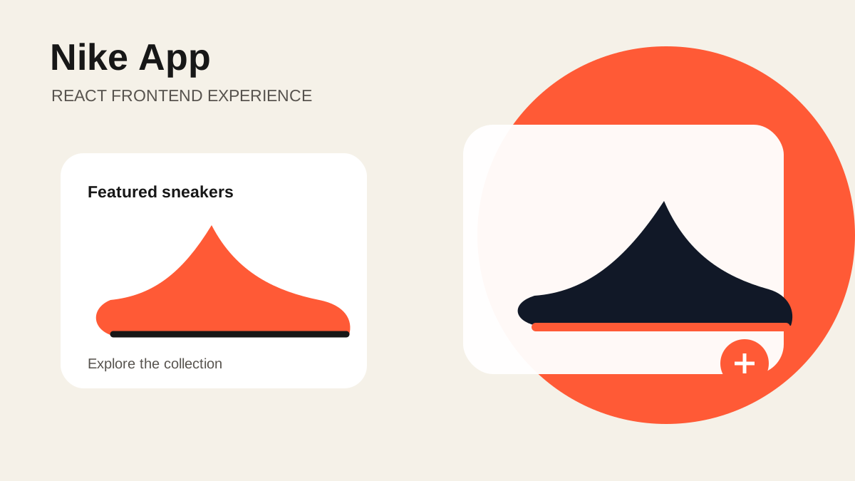
Nike App
Responsive Product Interface Built with React and Tailwind CSS
Nike App is a responsive product-interface project built with React and Tailwind CSS. It explores how an e-commerce experience can present a visual product catalogue while keeping navigation, product information, and actions clear across different screen sizes.
The Interface Goal
Product interfaces have to balance strong imagery with practical information. A shopper needs to recognise the product, compare options, understand price and availability, and find the next action without searching through the page. The project focuses on arranging those elements into a clean, reusable frontend experience.
The application treats products as structured data rather than hard-coded page fragments. A product record can provide its name, category, price, image, colour options, and availability. React components then decide how that data appears in a list, featured section, or detail view.
Component-Based Structure
Reusable components are useful only when their responsibilities stay clear. Navigation handles movement through the application. Product cards present a compact summary. A product detail area gives more space to imagery, variations, and purchase controls. Small components such as badges, price labels, and option selectors keep repeated visual rules consistent.
Data flows from the page into those presentational components through props. Interactive choices such as a selected colour or size remain in state close to the interface that changes them. This avoids a single oversized component that owns every product and interaction.
Responsive Layout with Tailwind CSS
The layout is designed from narrow screens upward. Product grids begin with a small number of columns and expand when enough space is available. Detail sections can stack on mobile and sit side by side on larger displays. Spacing and type sizes change at deliberate breakpoints instead of shrinking the desktop design until it barely fits.
Tailwind CSS makes those layout decisions visible beside each component. Repeated combinations can still be extracted into components so the code does not become a collection of copied class lists. The aim is to keep responsive behaviour consistent while preserving the speed of utility-based styling.
Interaction and Feedback
Product actions need immediate visual feedback. Selected options should look selected, unavailable options should be disabled, and buttons should communicate whether an action is possible. Hover and focus states support mouse and keyboard users without changing the overall layout.
Image loading and empty states also affect perceived quality. A stable image area prevents the page from shifting while assets load, and fallback content keeps a missing image from breaking the card. Descriptive alternative text makes product imagery useful to screen readers.
Scope and Next Steps
The current project demonstrates the frontend experience. A production store would also need a product service, inventory checks, authentication, a persistent cart, checkout, payment processing, order history, analytics, and careful security review. Those systems should be added behind stable interfaces rather than mixed directly into visual components.
Further work could add a filterable catalogue, URL-based product routes, saved favourites, accessible modal behaviour, and automated component tests. Performance work would focus on responsive images, code splitting, and avoiding unnecessary re-renders in larger product collections.
What This Project Demonstrates
Nike App demonstrates component design, responsive layout, UI state, and product-focused frontend thinking with React and Tailwind CSS. Its main value is the disciplined translation of product data into a consistent interface.